My work

Stitching Tradition

Dan the Handyman

Undersea
iAnna

The seasons in motion

Guide to Polish and English traditions

StudentU
About me
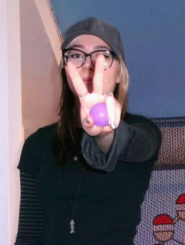
Hello! My name is Olga Chojnacka.
My design story, as with many others, starts with drawing. As a child I would always be drawing something, all the time. You literally couldn't get those pencils away from me, and that creativity has followed me throughout my life, it was a safe space that I could go back to again and again.
My first experience with graphic design started in college when my Animation course turned into a Graphic Communications course last minute due to staff changes. It was then that I was first introduced to all the basics of design, along with the Adobe software.
From then onwards is when I knew I was all in for design, my college experience was full of experimenting around with different styles and mediums which served as a good starting point into university.
I have a strong interest in editorial and motion design, I love including some personality in my work, but I am also skilled in designing for an existing brand image.
I am always eager to learn and try new things, I love experimenting and finding solutions to problems, it makes the result that much more satisfying!
Skills and Qualifications
I am an Adobe Certified professional in Illustrator and After Effects, and highly skilled with InDesign, Photoshop, and Figma.
I also speak both Polish and English fluently.
Find me on
Say hello!
Anything else you'd like to know? Pop your details in the form below and I'll get back to you ASAP!
"Stitching tradition"
Major project
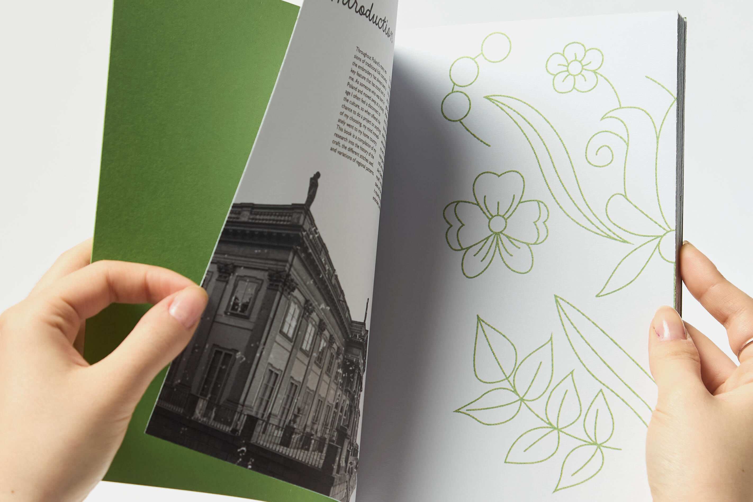
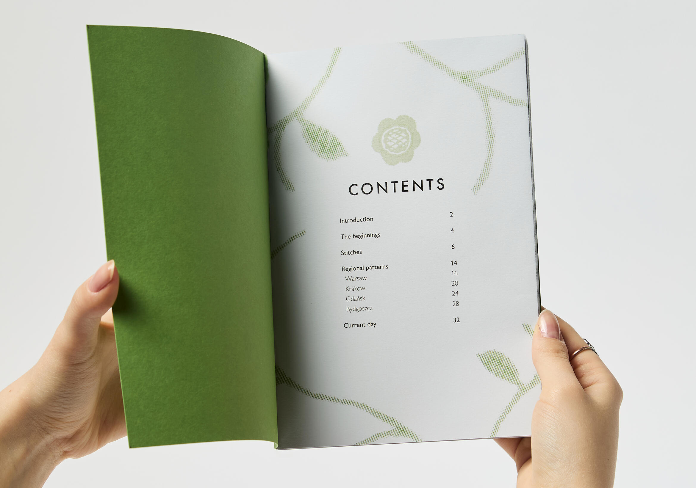
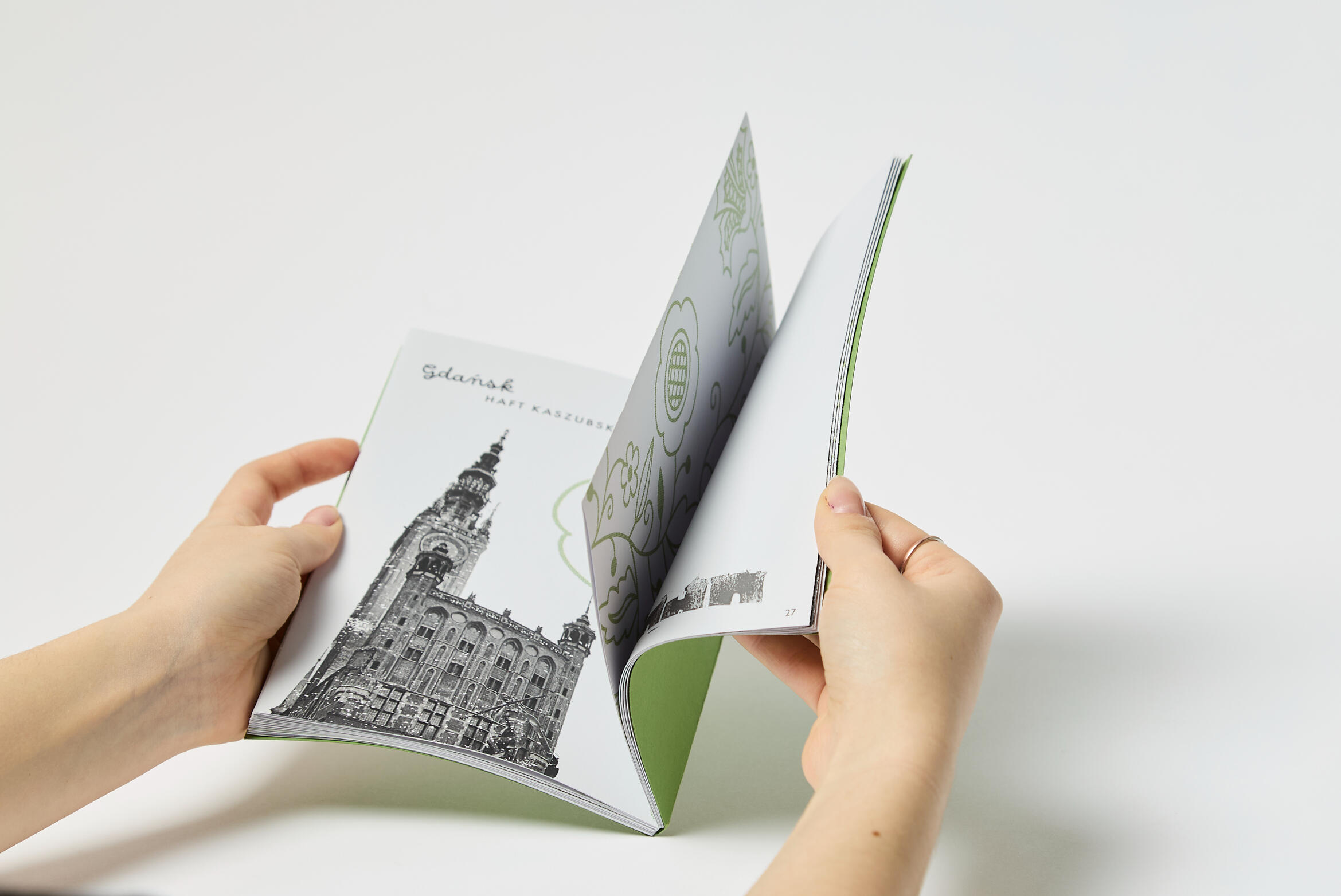
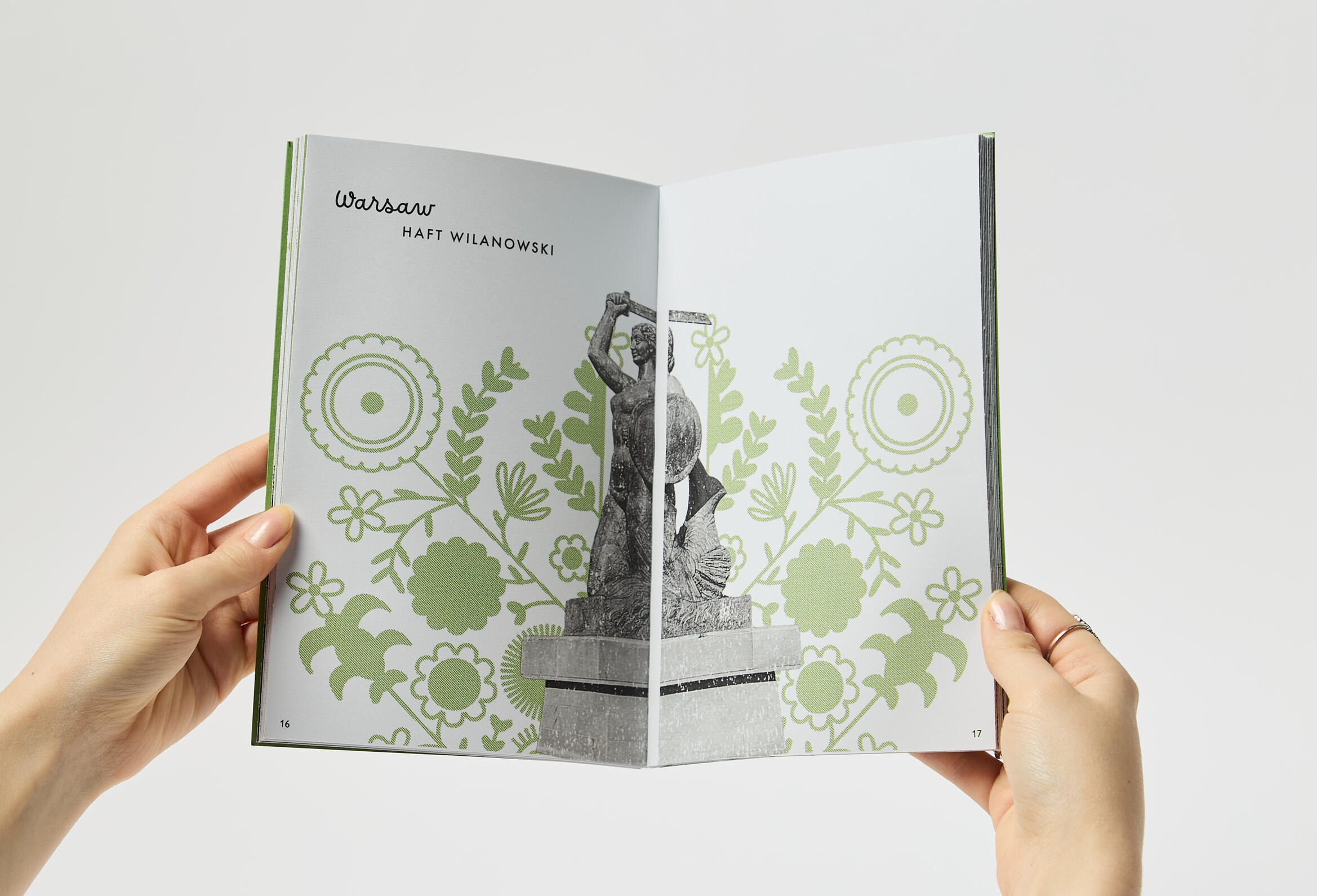
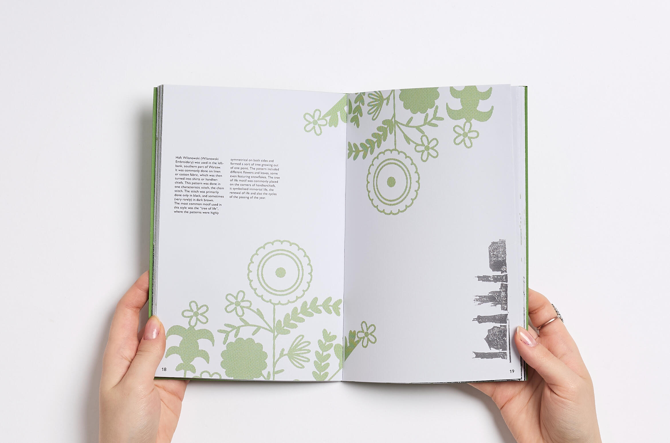
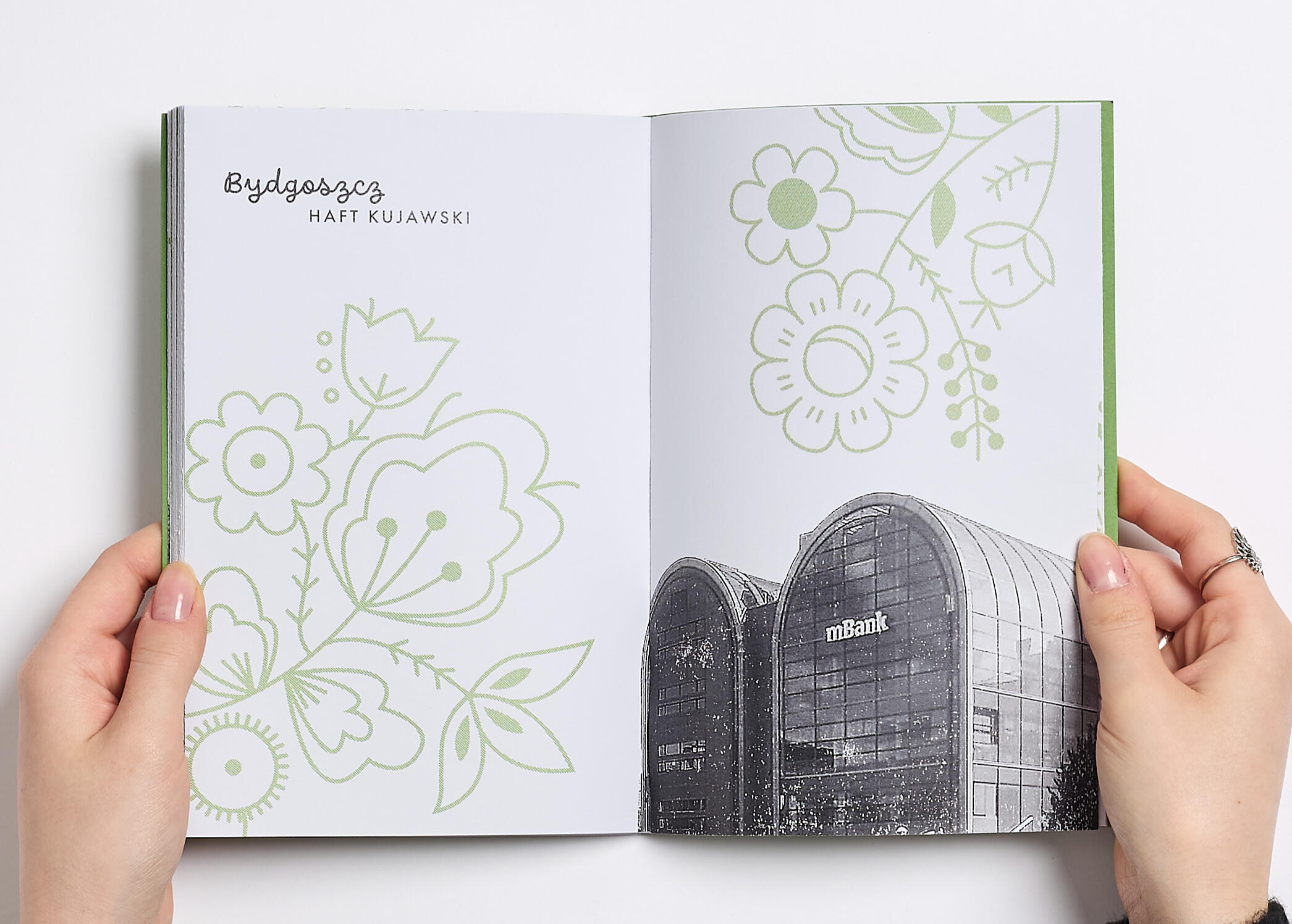
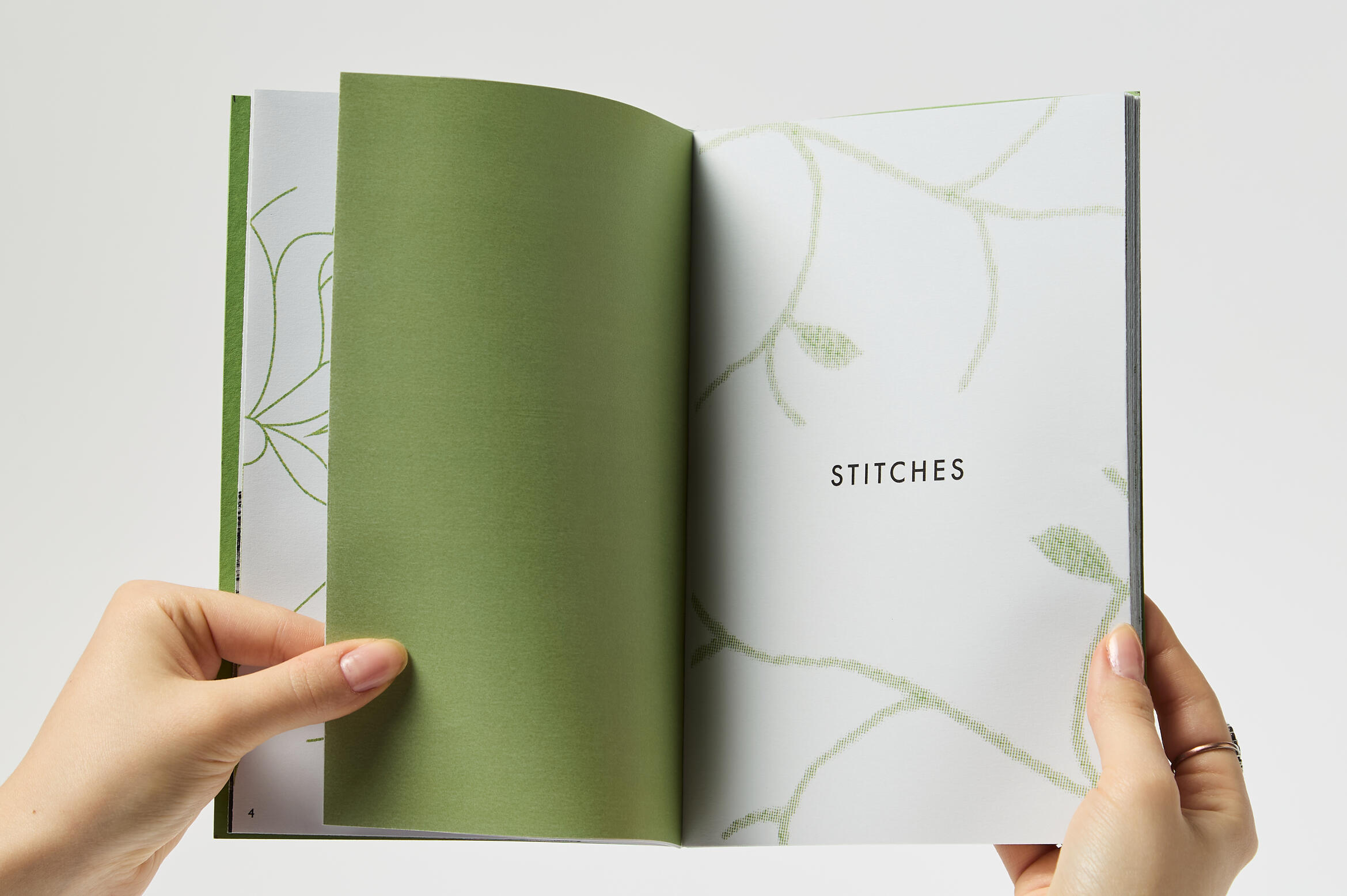
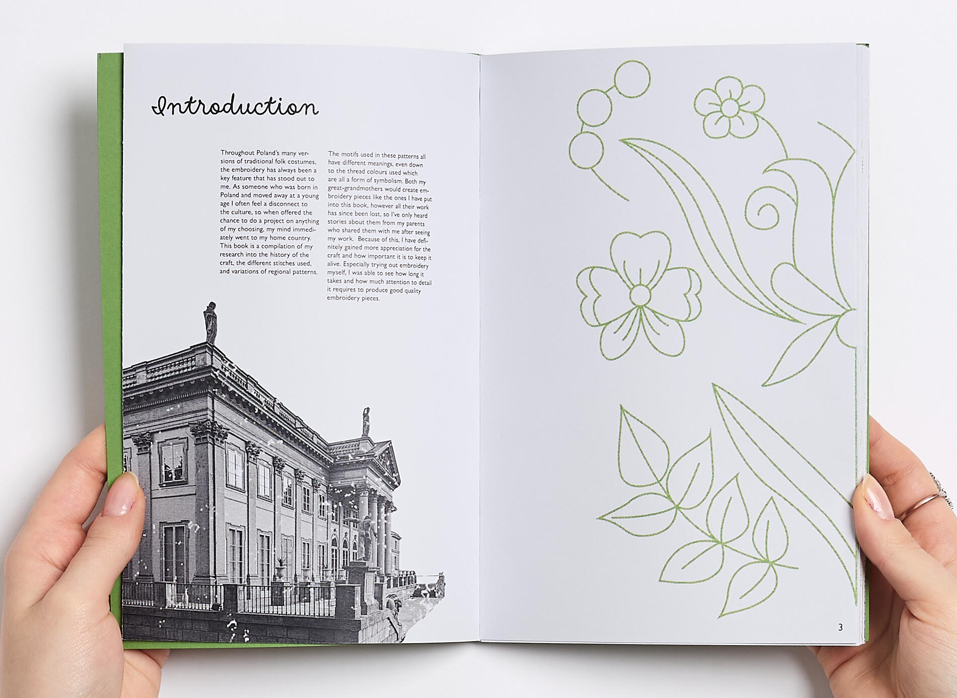
In our final university project we were tasked to make anything based on a topic of our choosing. I wanted to make something connected to me in some way, something that was a little more personal and showed off a part of me. Which is why I decided that for my major project I wanted to do something about Poland, so that I could deepen my connection with the country and also portray it creatively.Throughout my research I found out more about old traditions and customs, from old harvest festivals to folklore stories and pagan beliefs of the past. However, somewhere along the way I absolutely fell in love with Polish folk embroidery. The visual style of the art form captivated me; I wanted to find out what the different patterns meant and represented. I looked into the different stitches and techniques that were used in traditional embroidery pieces, and I even attempted embroidering myself. It made me develop a new appreciation for the craft, because I experienced first hand how long it would take to make the intricate details and beautiful patterns.
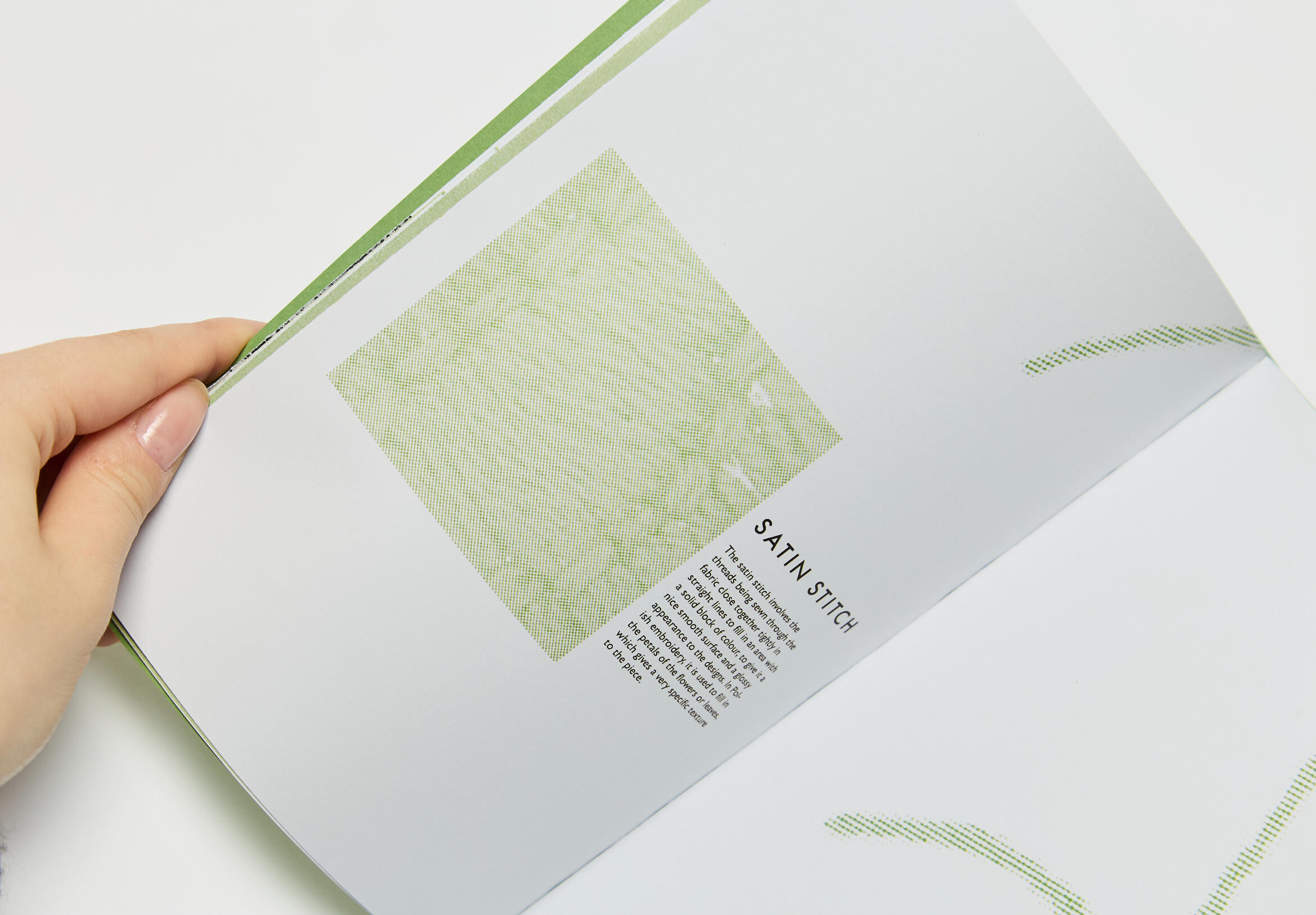
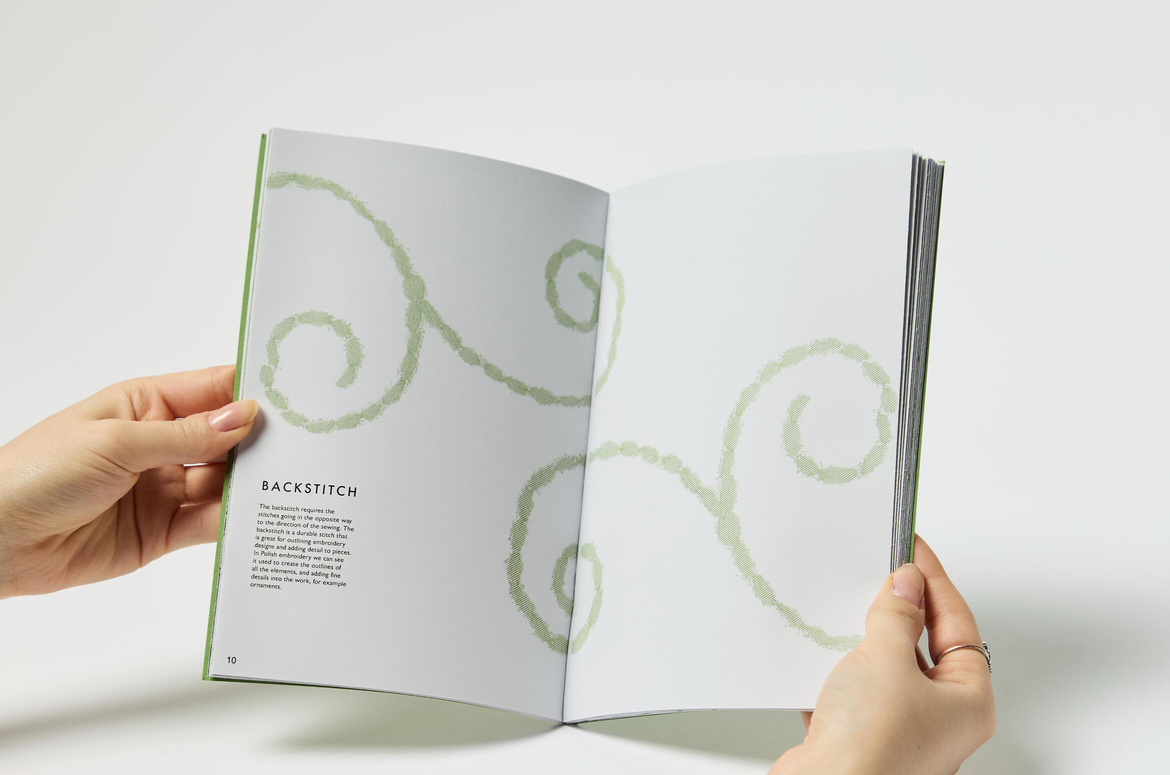
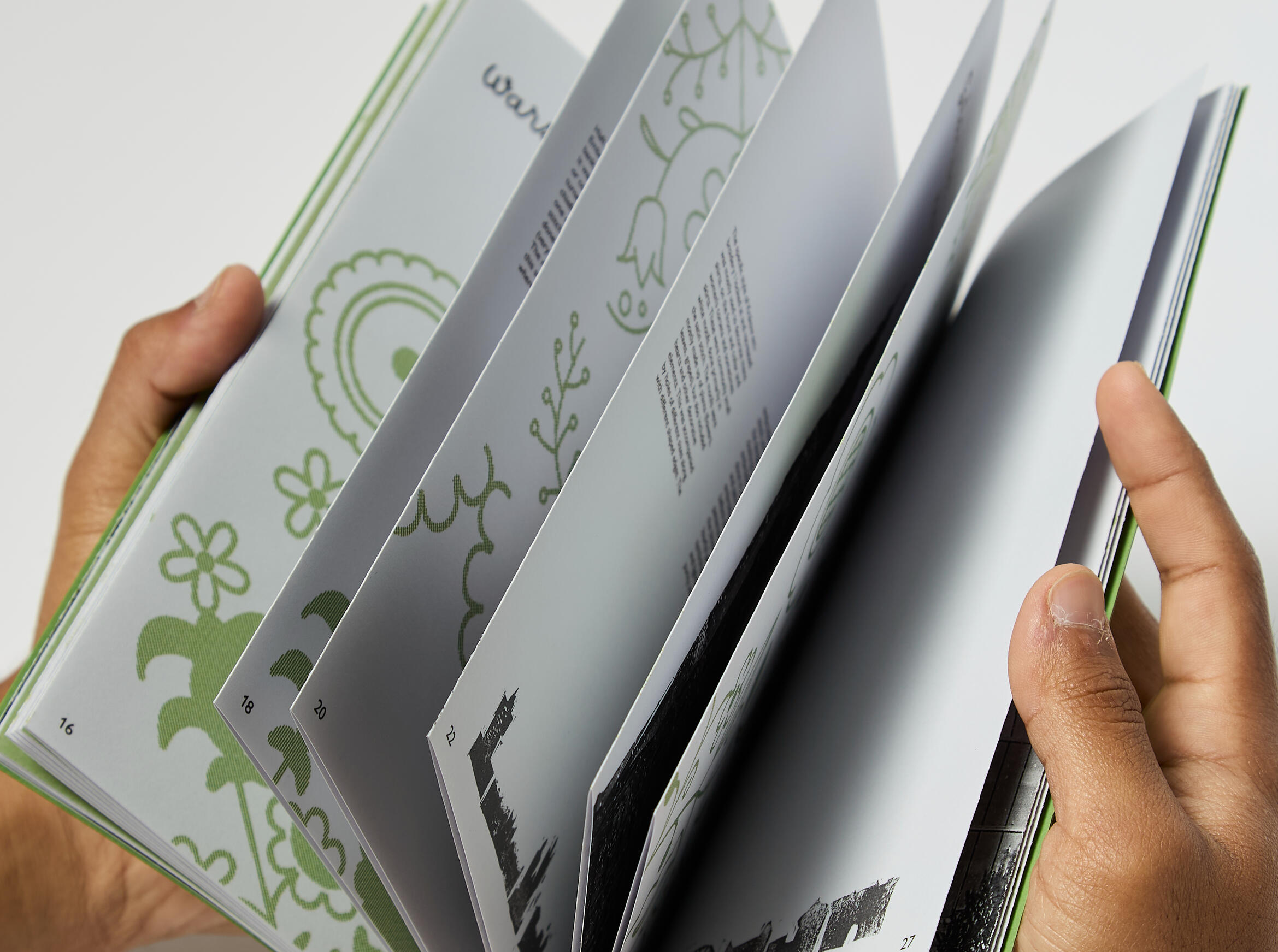
As a response to this, I created ‘Stitching Tradition’, a small book aiming to inform people about the cultural art form. It includes the different types of stitches and also varying styles of regional patterns from 3 major cities (plus my home city, Bydgoszcz). The text is a compilation of my research and discoveries, all written by me, and the photographs are either mine or collected from my family in Poland. Additionally, the embroidery patterns in the book are all my designs based on the respective regional styles, and the images of the stitches were ones I tried myself, scanned in and altered in Photoshop. I feel like this book is a little part of me, and the start of a new formed hobby to continue in my free time.
"The seasons in motion"
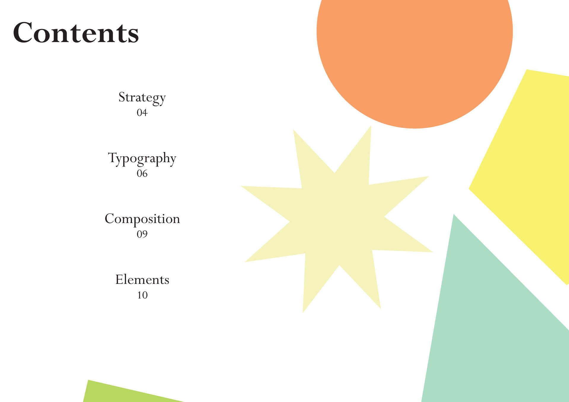
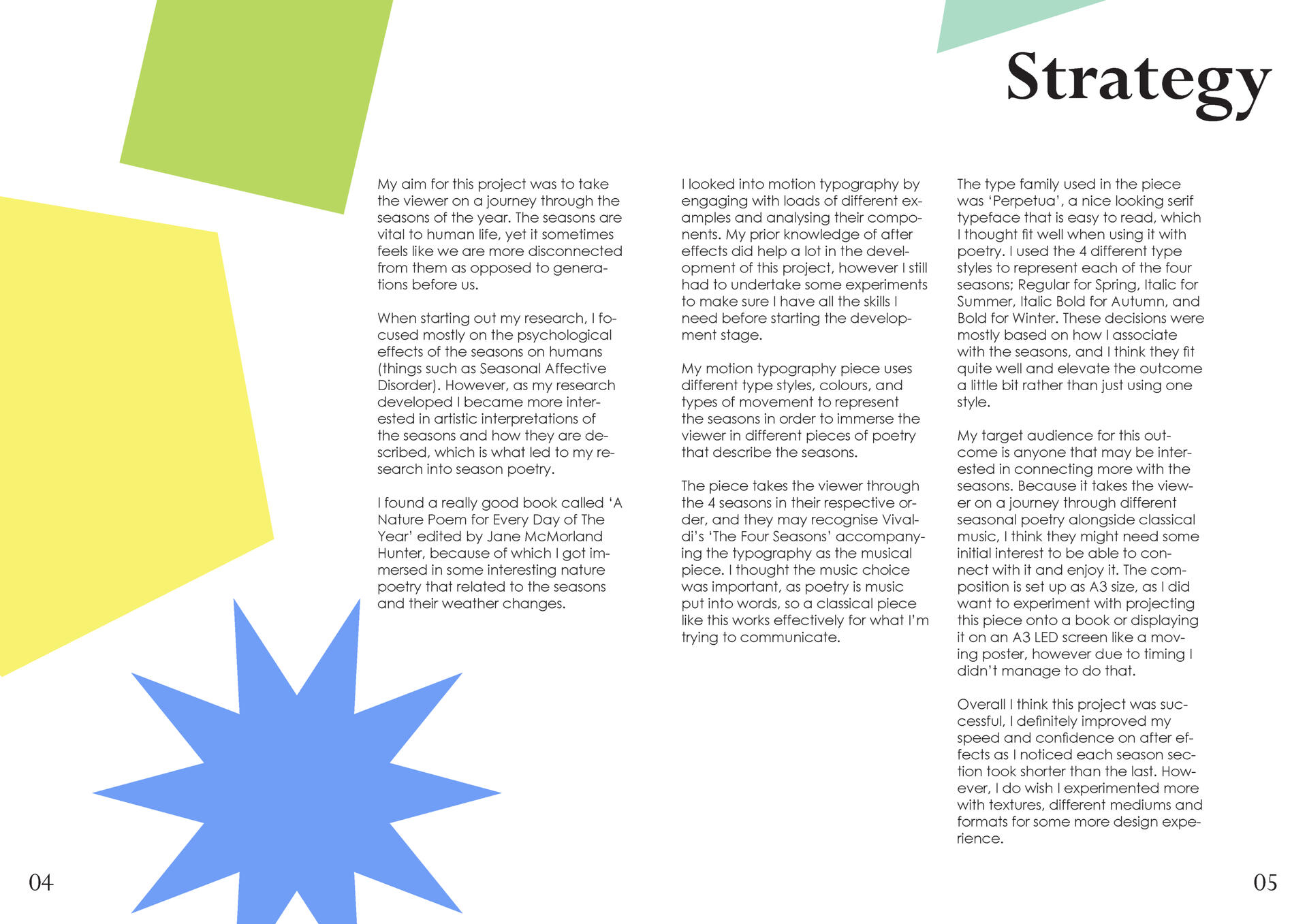
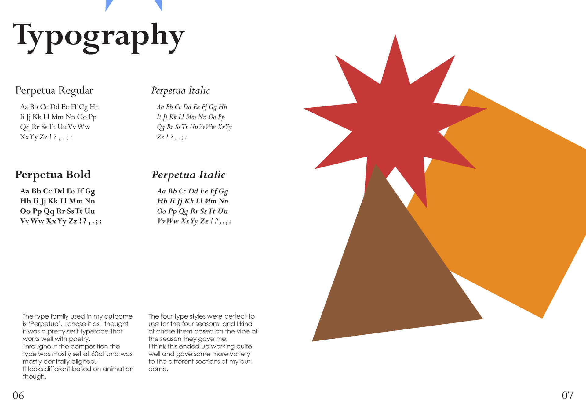
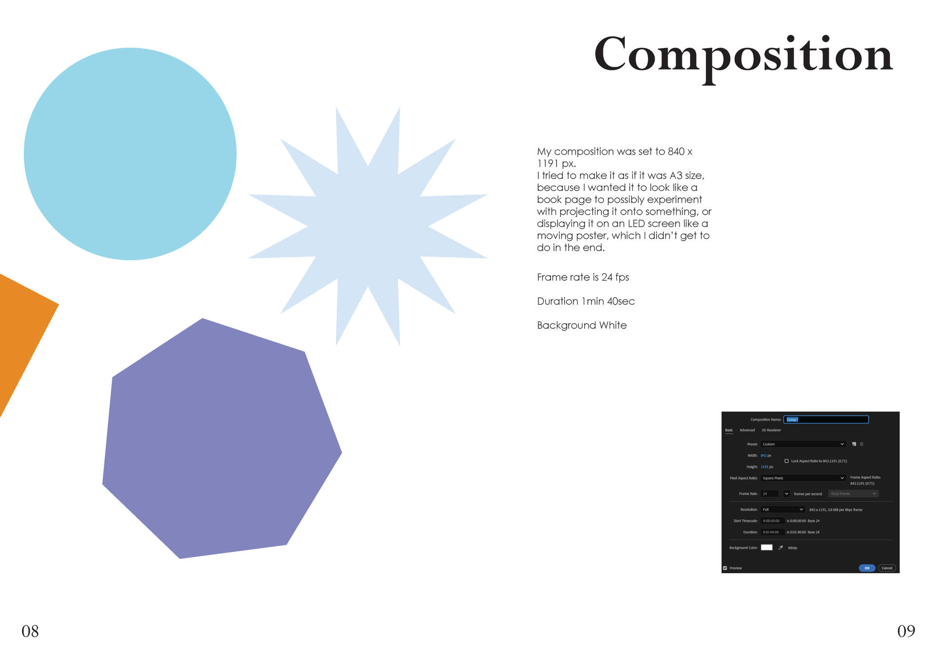
In this module we got a choice of 5 different briefs to explore further in order to create an outcome. My chosen brief was ‘Weather’, I thought that there was a lot I could look into for this brief. I got the idea to create a motion typography video that showcased the movement of the seasons and their differences.
During development I researched the seasons, their characteristics and also how they affect us as individuals. I thought seasons affecting human emotions was an interesting concept, I wanted to see how the seasons were described throughout time. This is when I started looking into different seasonal poetry pieces, I found that the language they used in relation to each of the four seasons was very interesting, and I made sure to show it in my final piece.
The music I used is Antonio Vivaldi’s “Four Seasons”, as I think it portrays the differences in the seasons very well, and it is also a very famous musical piece that many people would recognise.
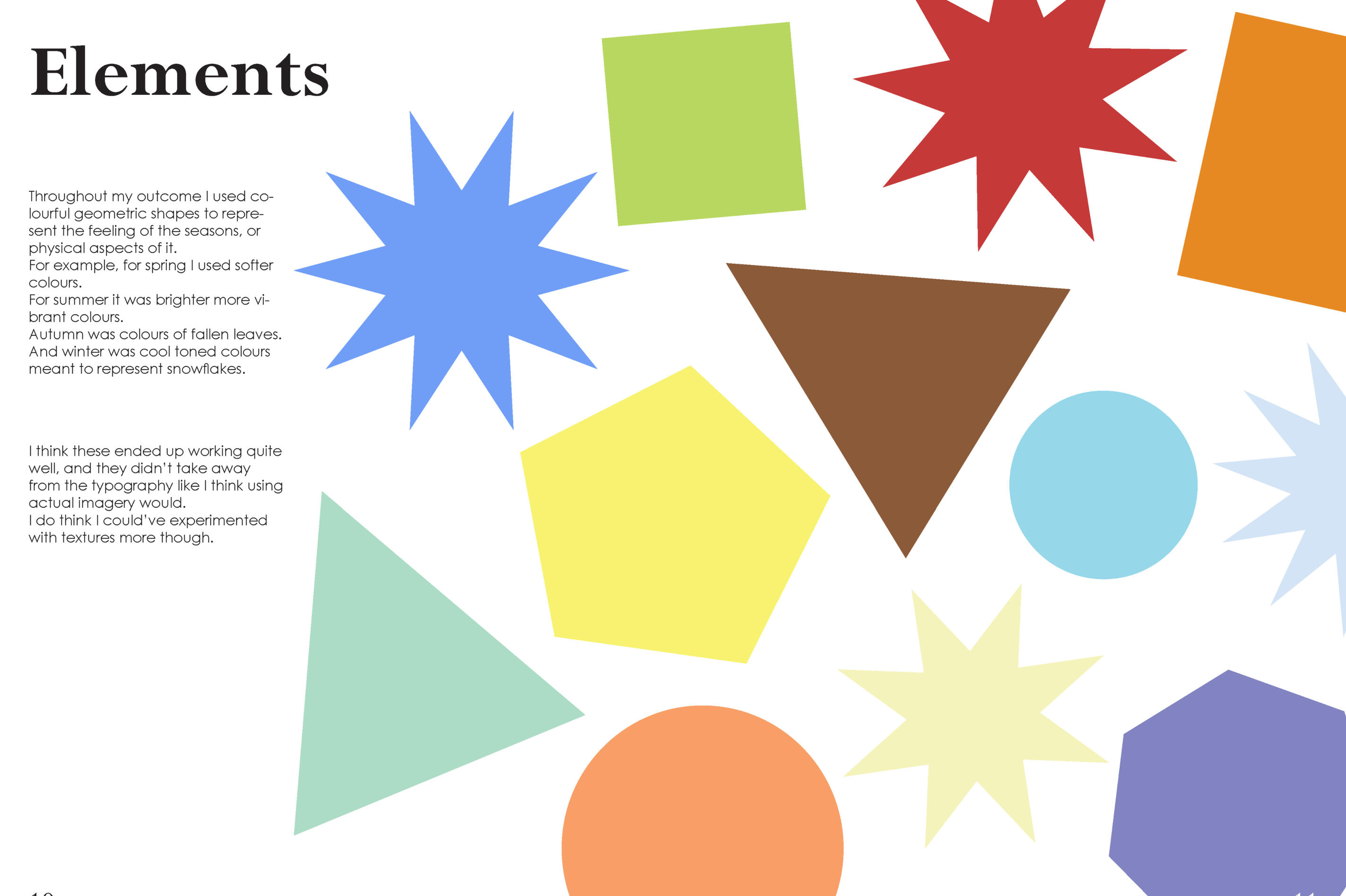
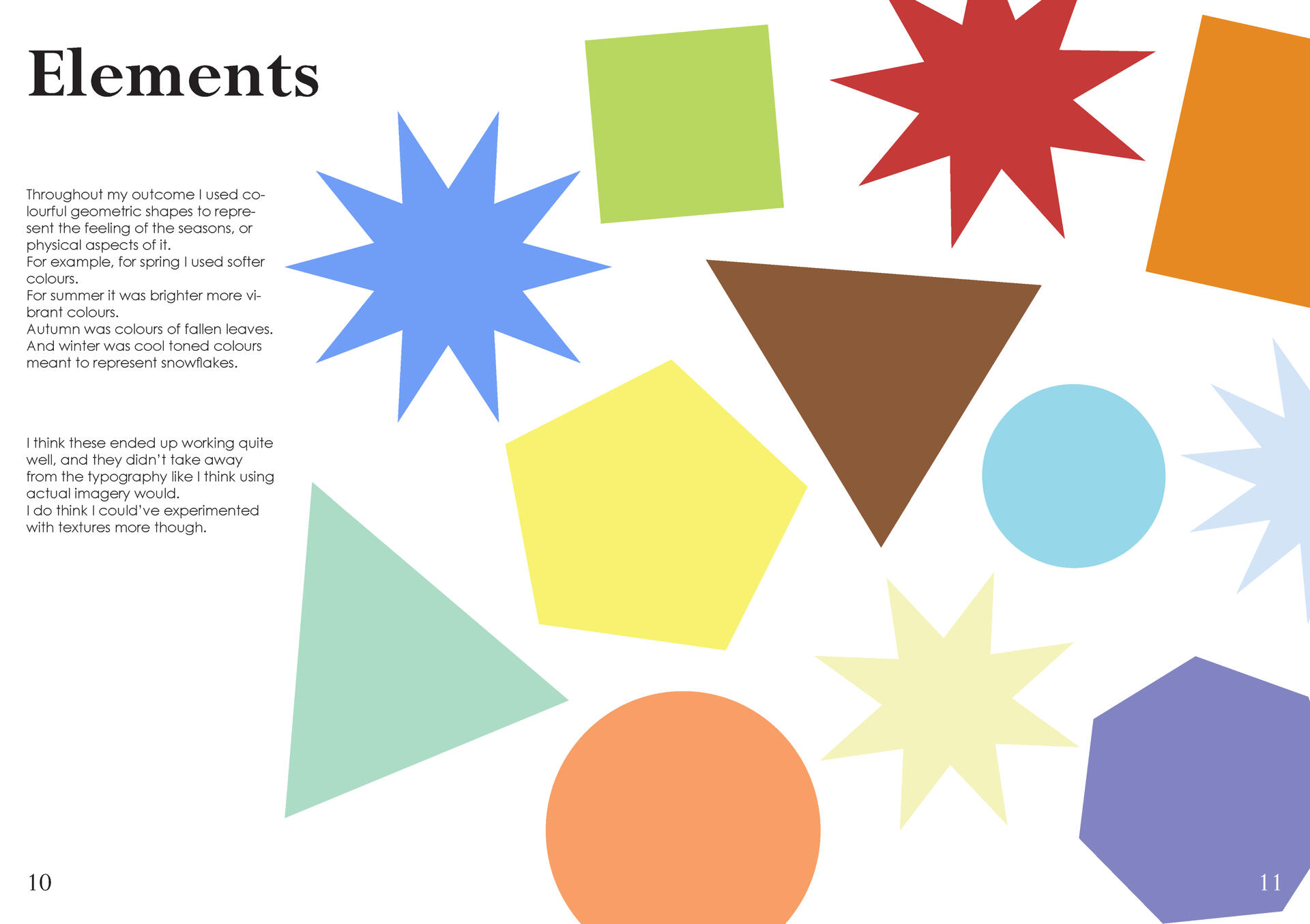
I was originally going to use imagery however I decided to go more abstract with the symbolism and only use shapes and colours in the video, which I think worked quite effectively.
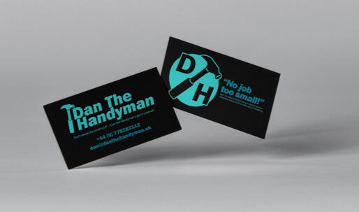
Dan the Handyman -
Independent Design Practice
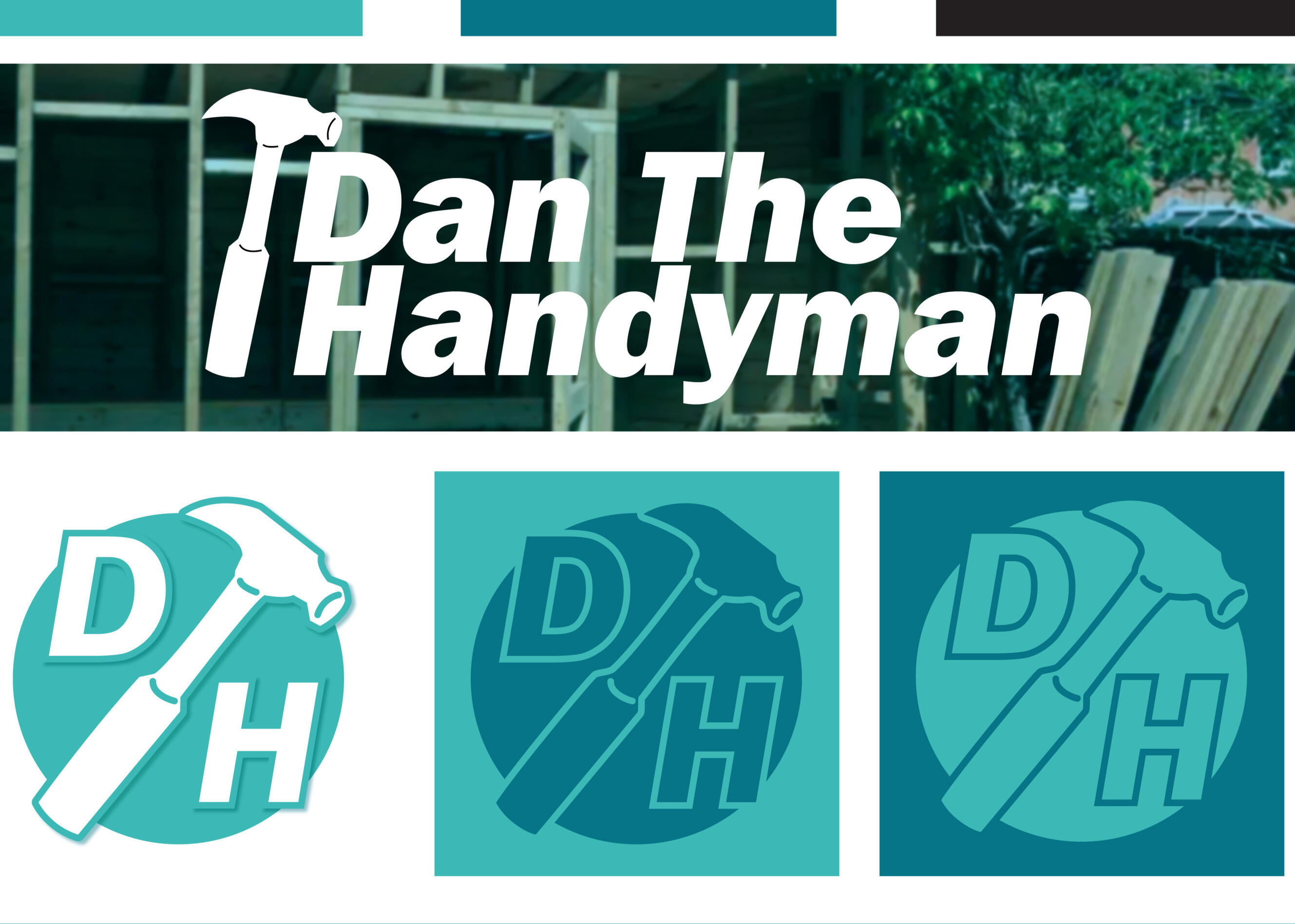
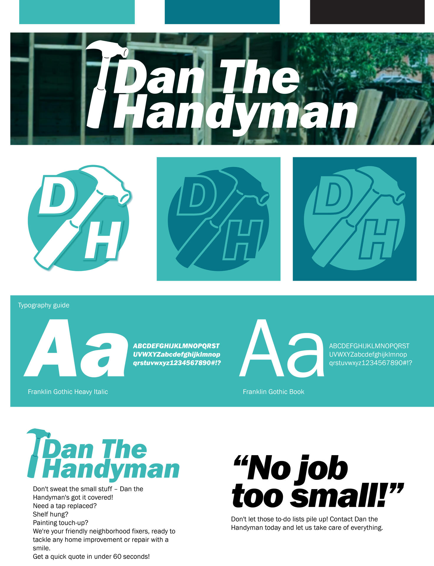
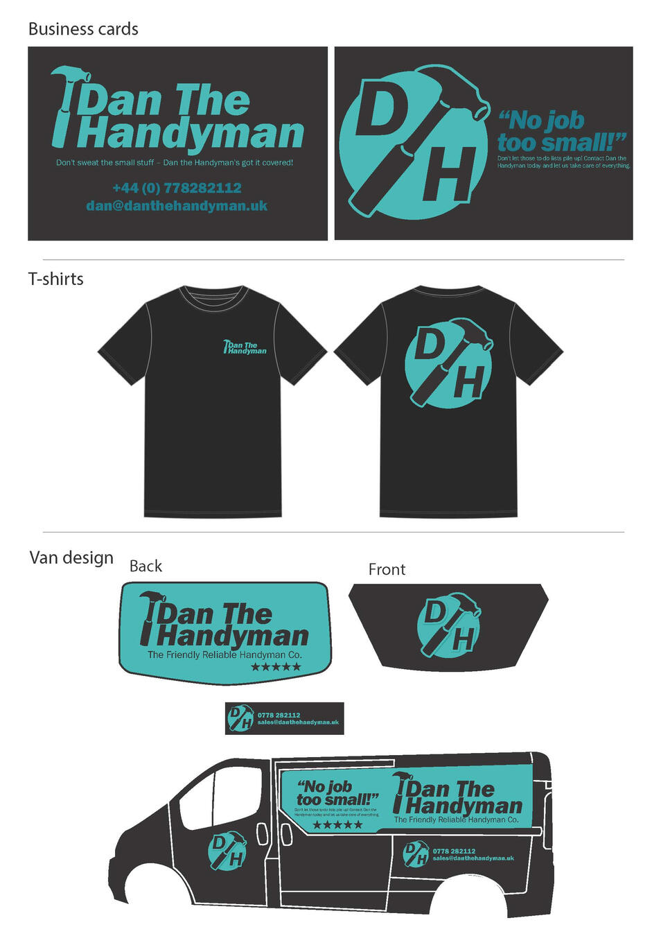
During my 3rd year of university my Independent Design Practice module required us to work with a client as a ‘simulated freelancing’ experience. It was my second time designing for a business, and I was a bit nervous because this time around I was actually directly sourcing the client myself.The client I made contact with was Dan the Handyman, a small handyman business, who asked me to work on some new brand assets. At first, the client had wanted me to use the original brand assets (logo, typeface, etc.) however after being unable to provide the original files we decided I would create a new logo and brand guidelines for them to use. The client also asked to keep the original colour scheme however wanted me to work more with black for the new logo and branding elements.
I researched different competitors and what they were doing that worked for them, in order to point me in the right direction for what Dan the Handyman can do to stand out and then designed the new logo in multiple versions so that the client could choose what they liked most.In this project I learned how to communicate with clients effectively to come to a result they are happy with, and I also learned the background elements of freelancing, e.g. making terms and conditions, hourly rates, pricing, etc. Overall the module helped build my professionalism, and my confidence in taking on more client work in the future.
"A guide to Polish and English traditions"
Visual Culture
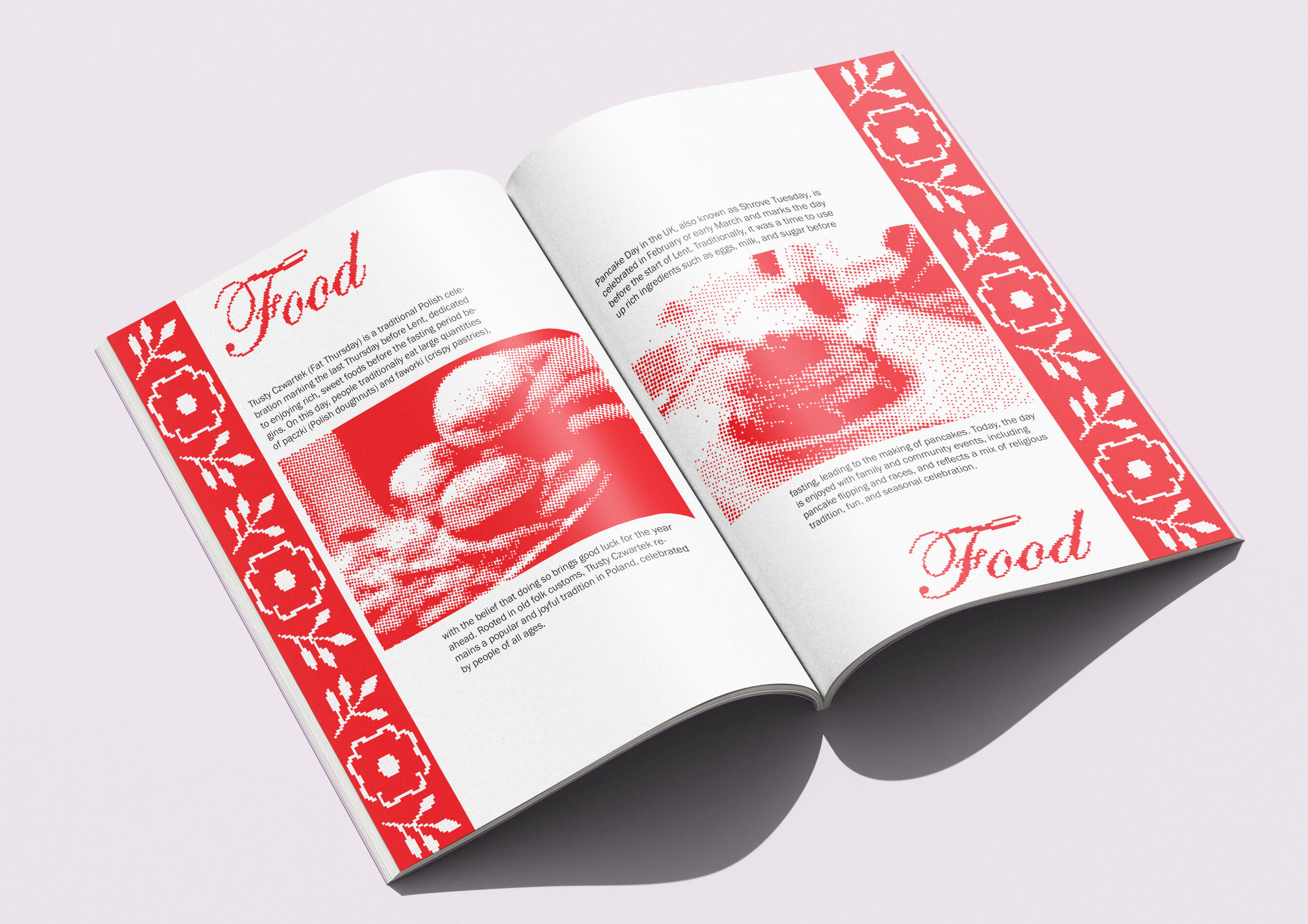
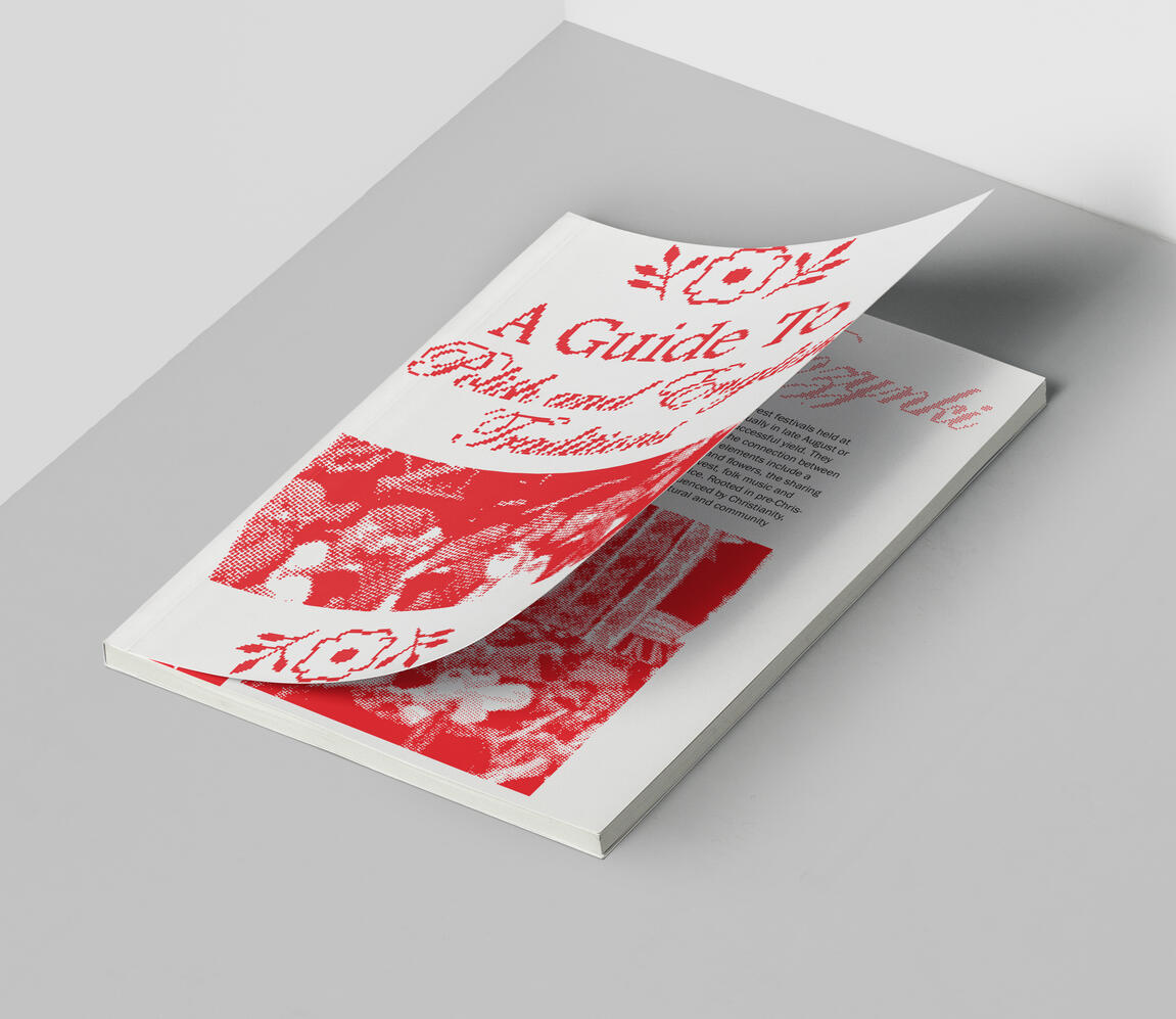
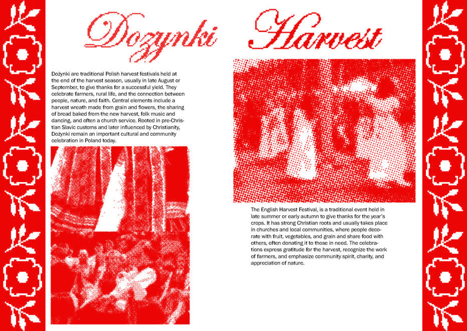
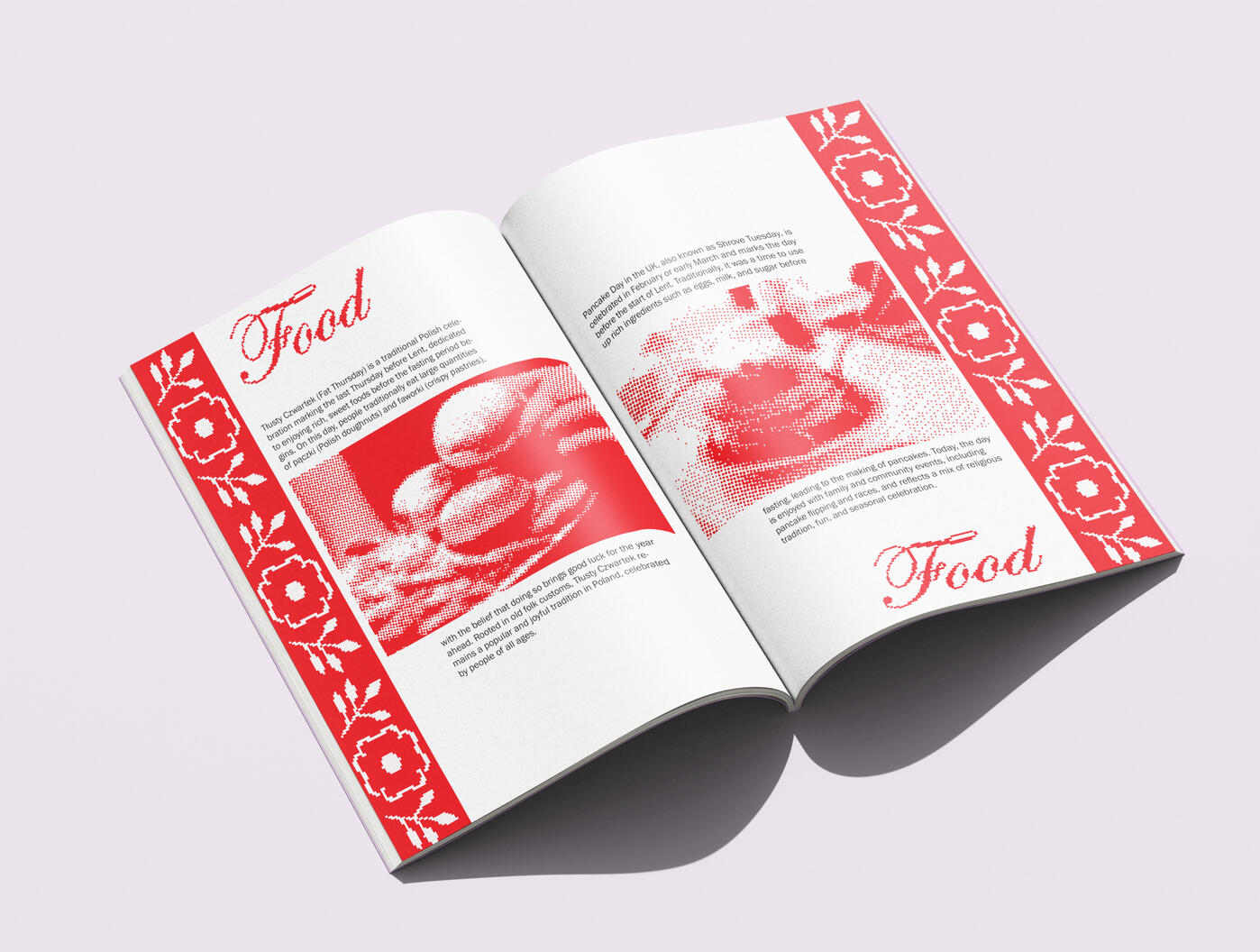
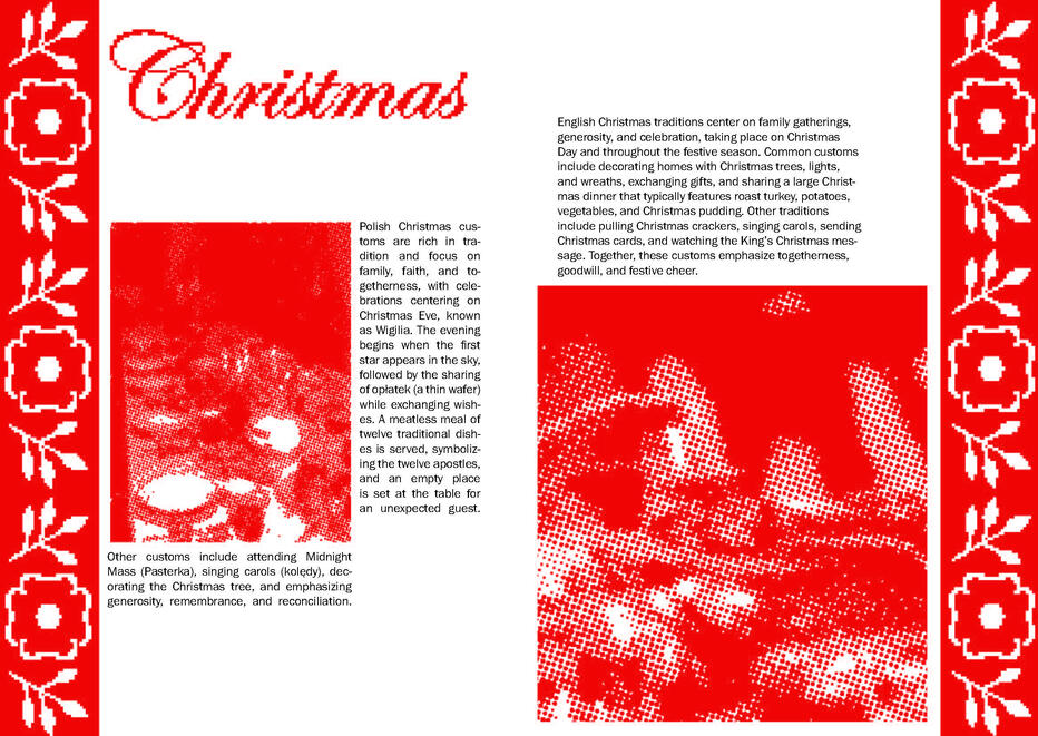
For my visual culture module we were tasked to produce an outcome and a written portfolio on one of the themes: history, representation and positionality, ethics, and technology. The subject was suggested to link to our major project research, for which I was researching Polish traditions at the time.I got the idea to compare Polish traditions with traditions in England, as they are my two home countries. I thought it would be interesting to see how they are the same or different, and also how they changed throughout history (my chosen theme).
The main design motif is a cross stitch pattern I designed and made in Illustrator, and the book guide is designed in red and white (the colours present in both countries’ flags).
I really enjoyed researching for this project and it definitely helped to connect myself with traditions I may have not been aware of before.
"Undersea"
Editorial Design
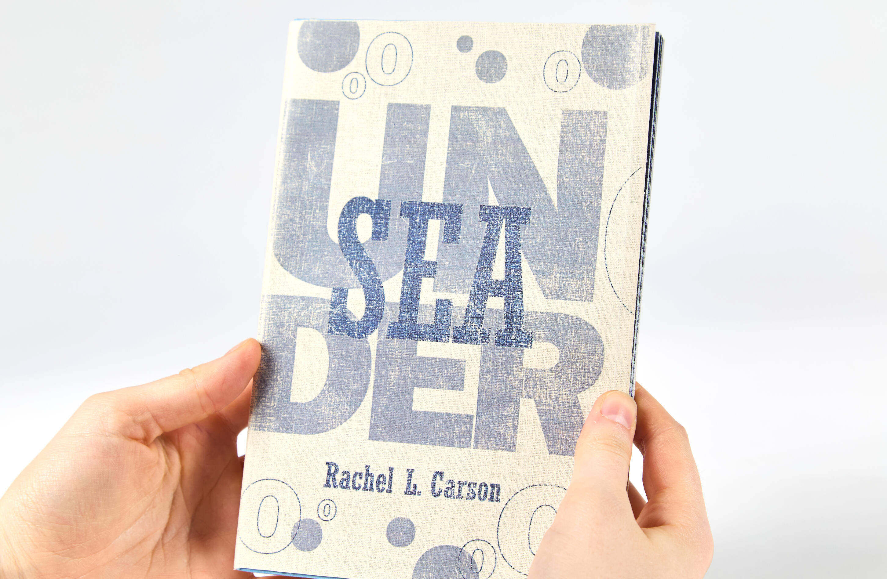
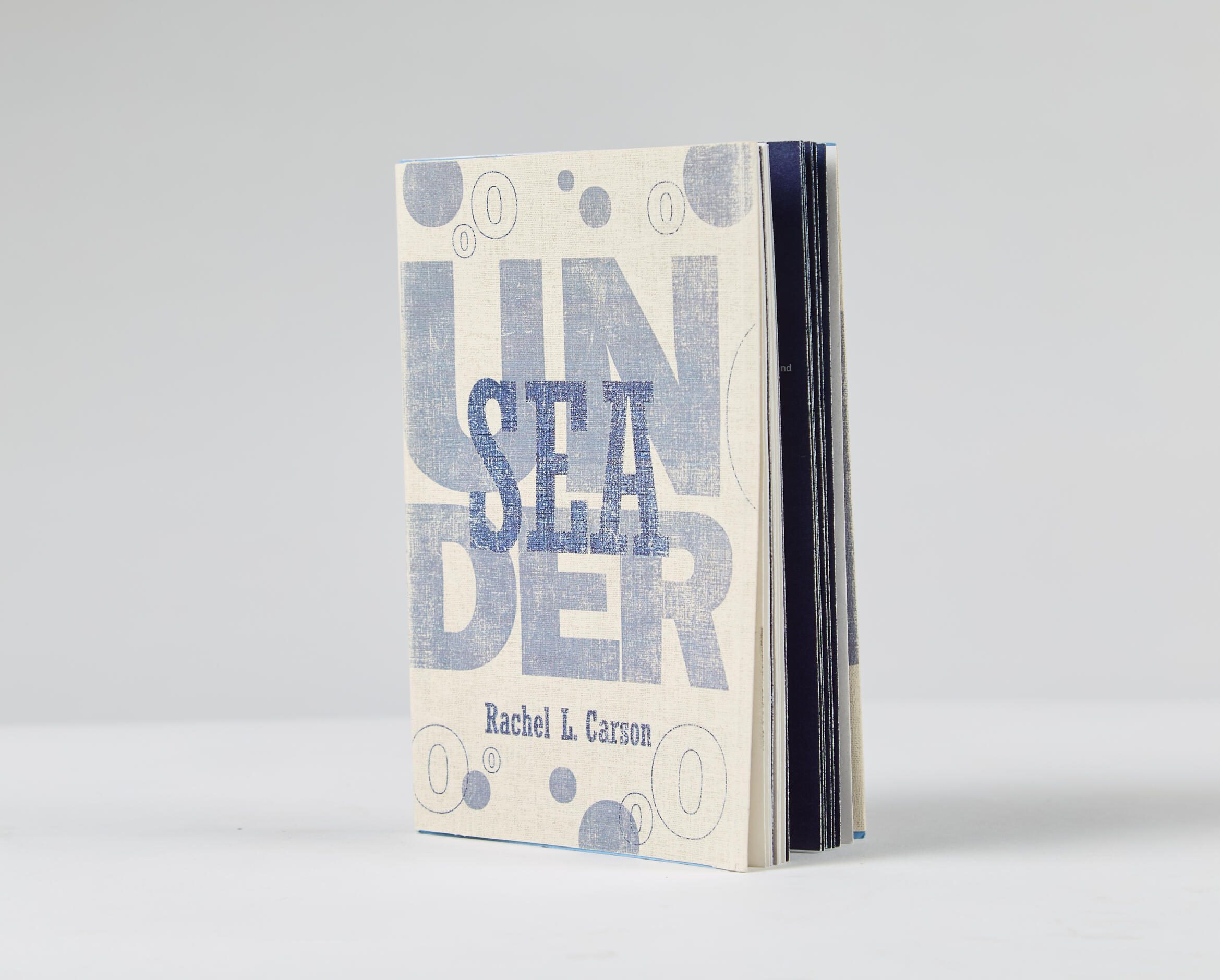
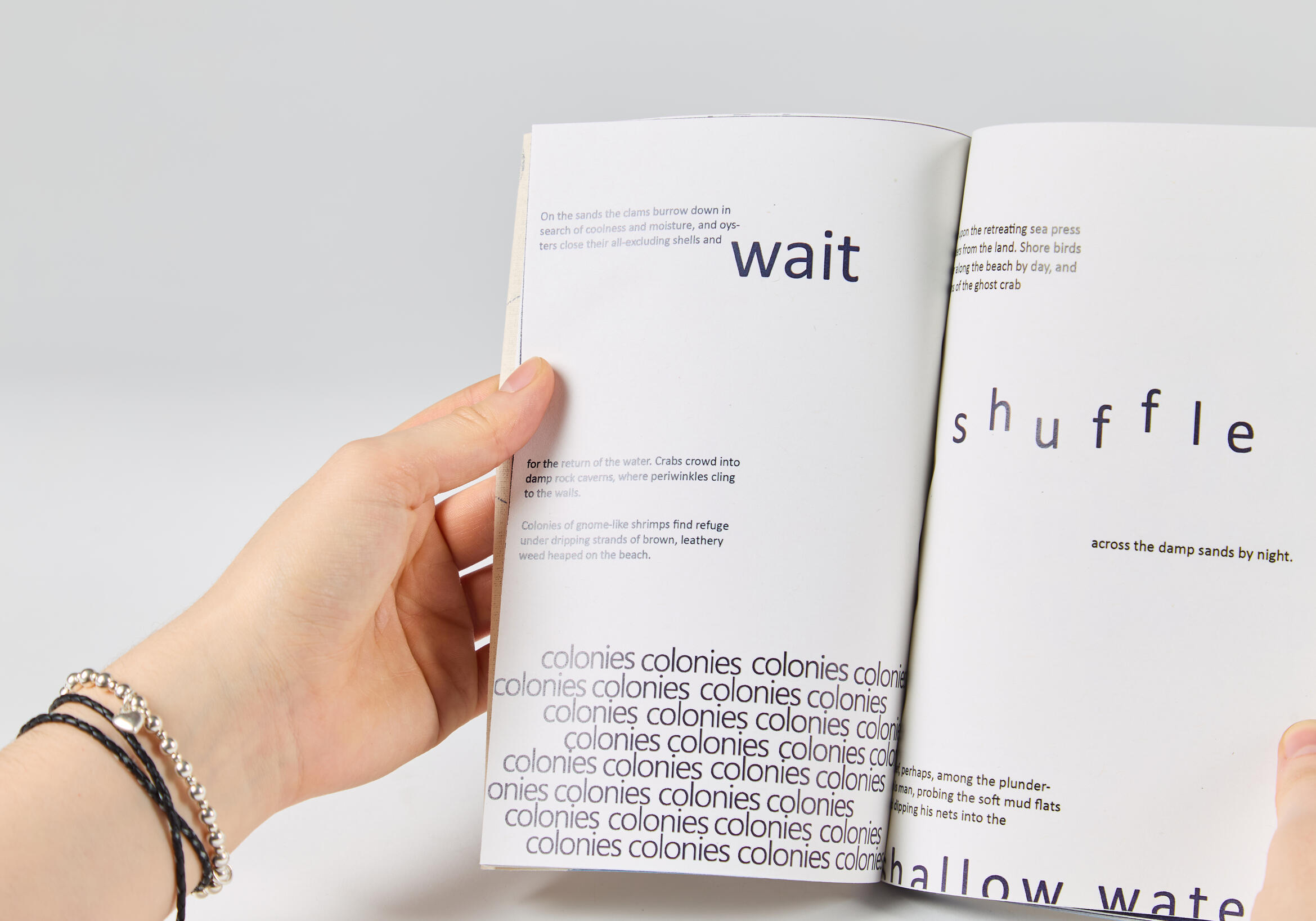
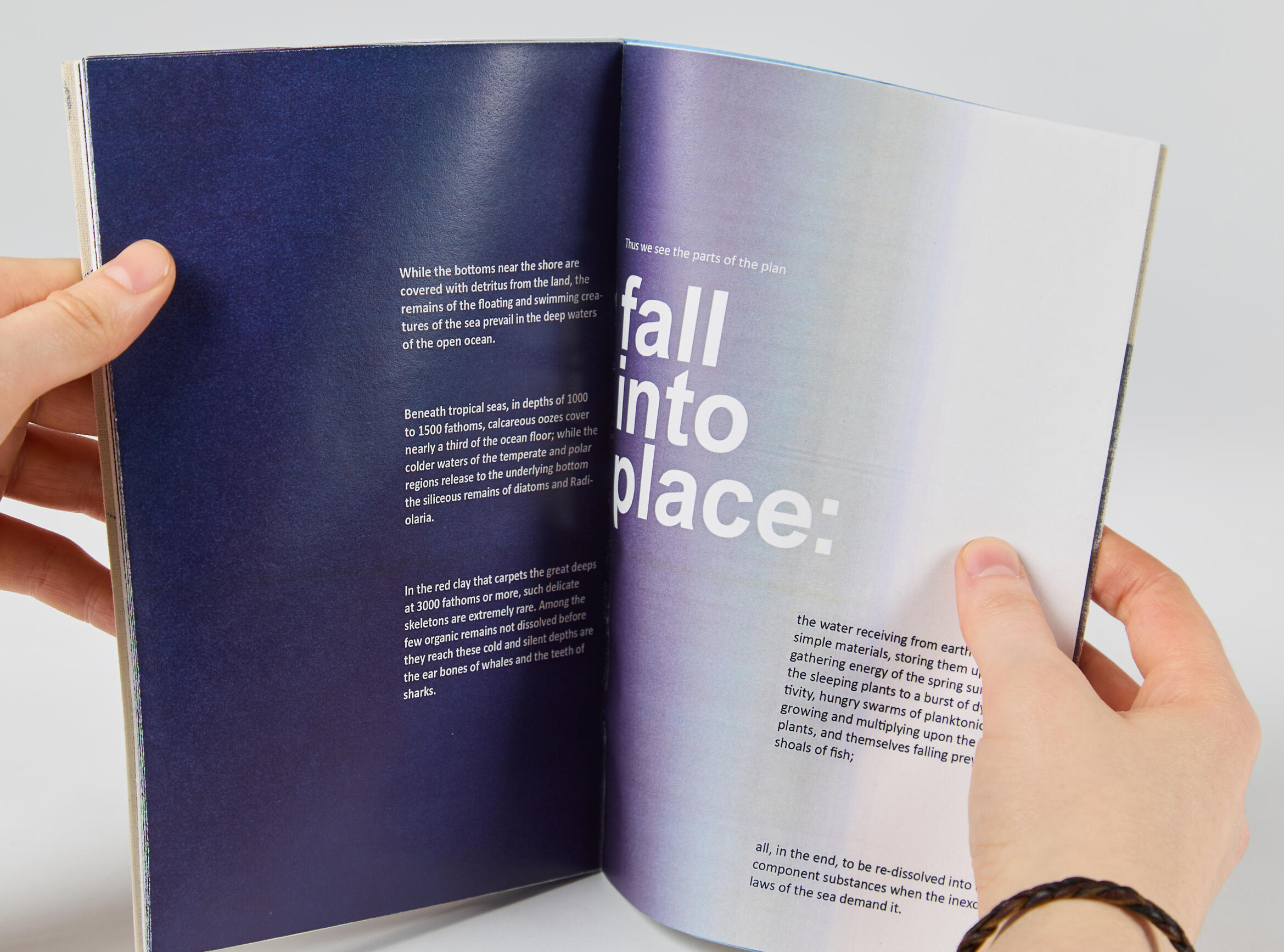
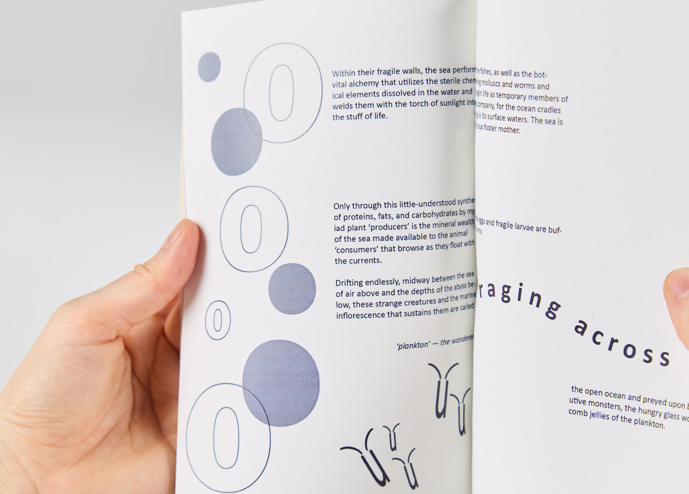
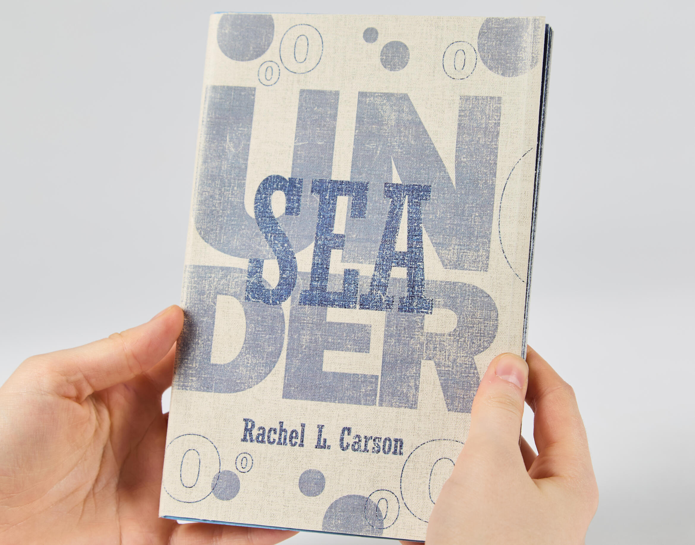
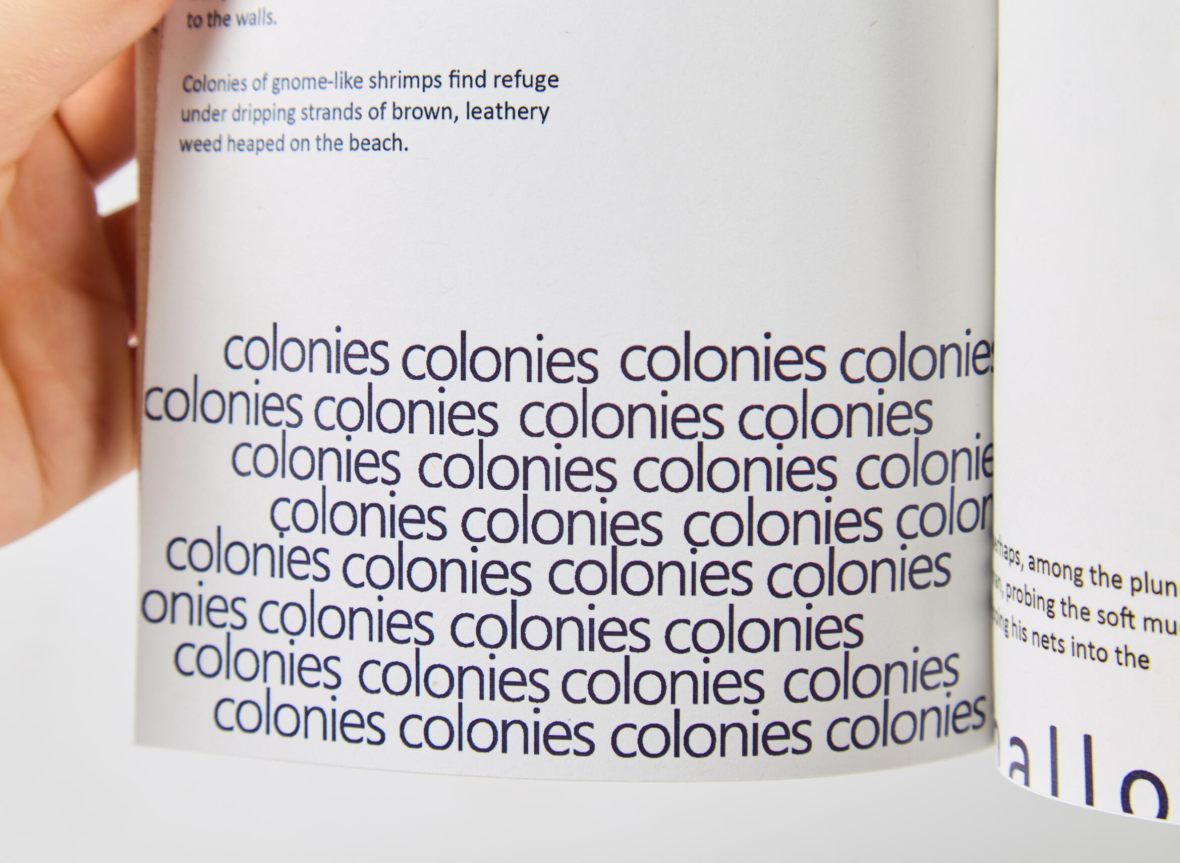
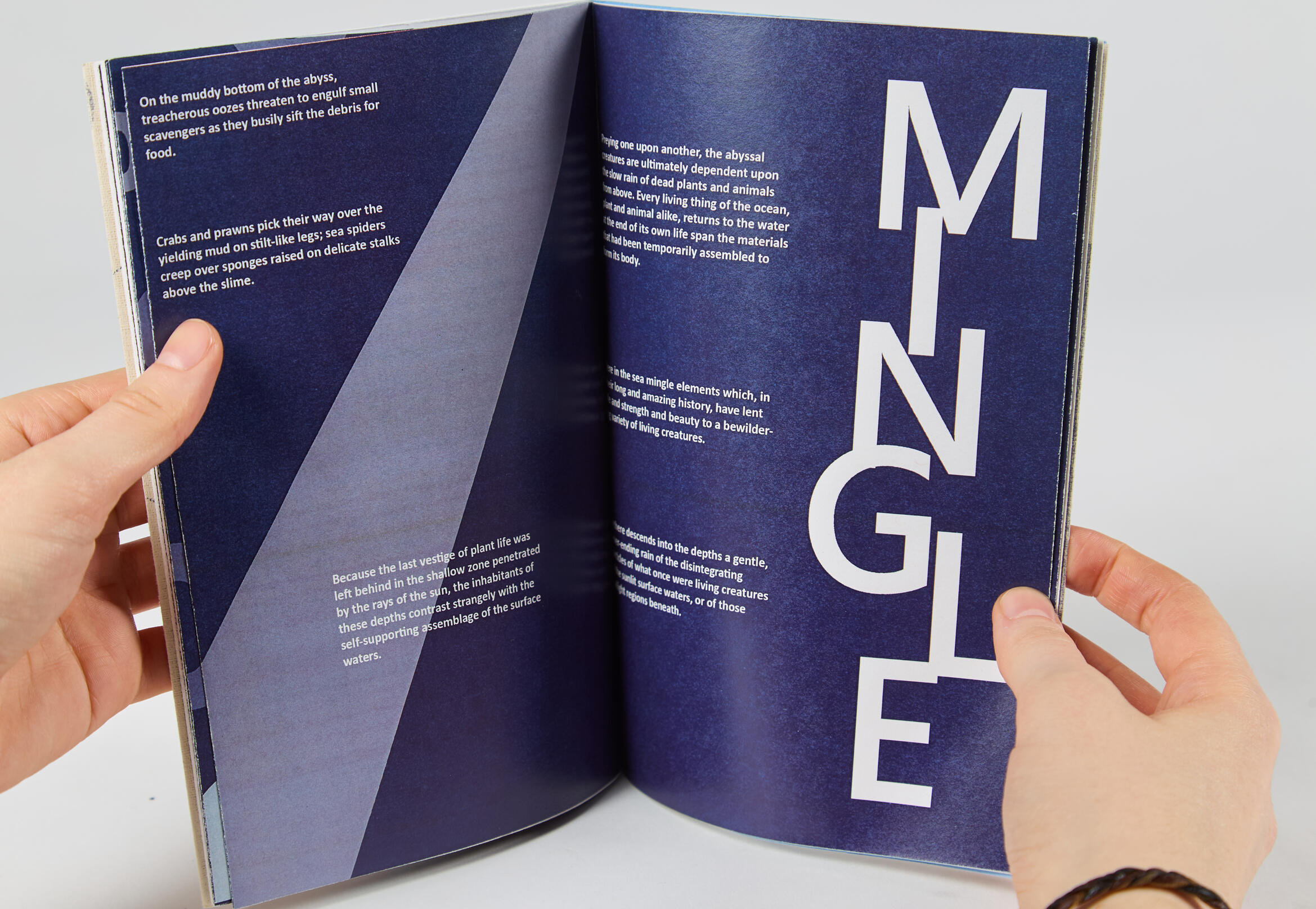
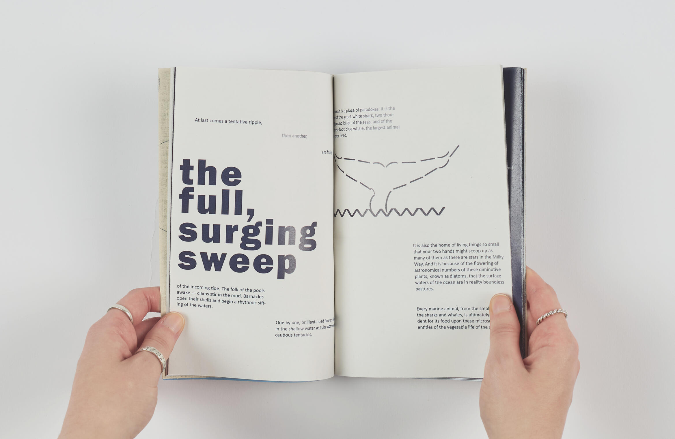
This project was for my editorial design module in my 2nd year of university. The brief required us to typeset and design a book for our choice out of two different texts. For my project I chose ‘Undersea’ by Rachel L. Carson. The text follows the journey through the ocean, describing the different life forms that live within it and the different processes of their habitats and the tides.I researched typesetting and looked at some different examples in order to start generating ideas. I thought it would be interesting to play with the words themselves and make the typesetting tell the story, I made some of the words float across the page as if submerged in water and others would scatter and gather like the fish colonies.
I also created illustrations using type to align with this idea, as I wanted as much of the book as possible to be just type.My final bound book also shows the change from the surface levels of the ocean to the very deepest parts through the use of page colour, as I wanted to also take the reader on a journey into the ocean. Overall I think this project sparked my initial interest in editorial design and book binding, as I thought the process of making something physical was very rewarding.
StudentU
UX design
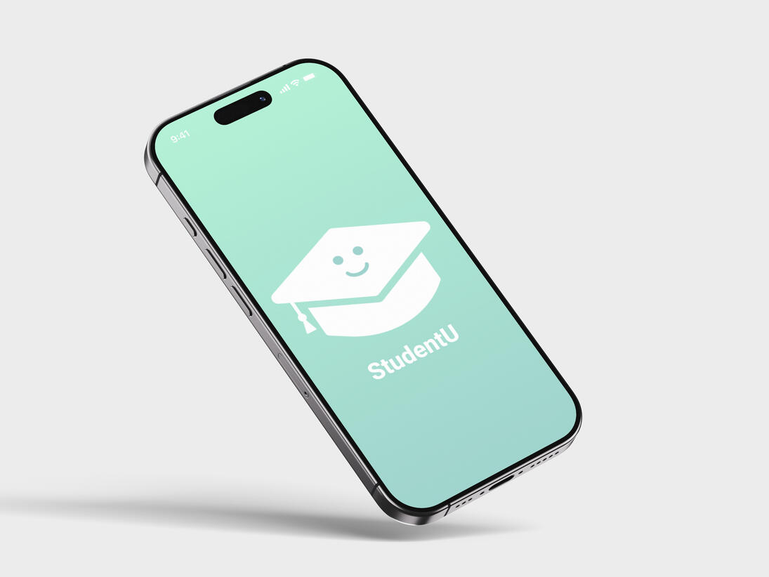
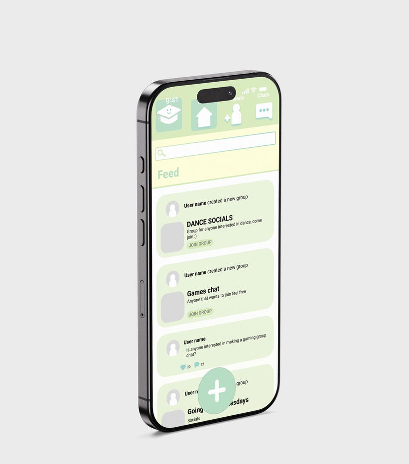
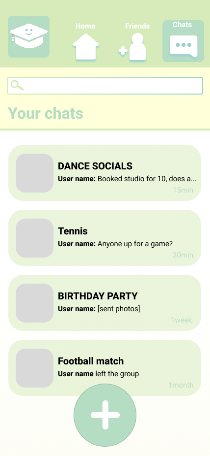
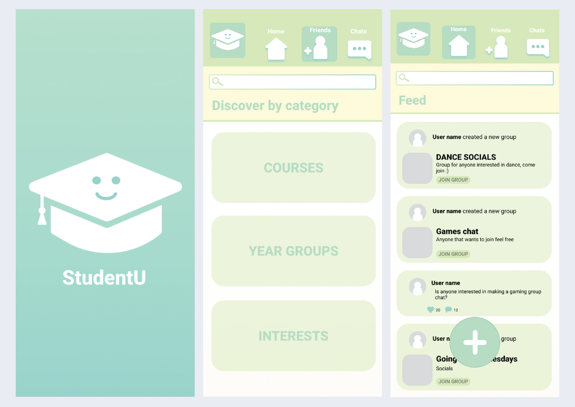
StudentU is an app prototype I created for my UX design module in 2nd year. This was my first time working with app design, and I really enjoyed it. Our task was to create an app to help new university students connect with each other and find friends, and as a response to this I designed ‘StudentU’.StudentU relies mainly on its group chat creation feature. Users are able to create group chats for different social events and post them to the ‘feed’ to increase reach and get anyone interested to join.
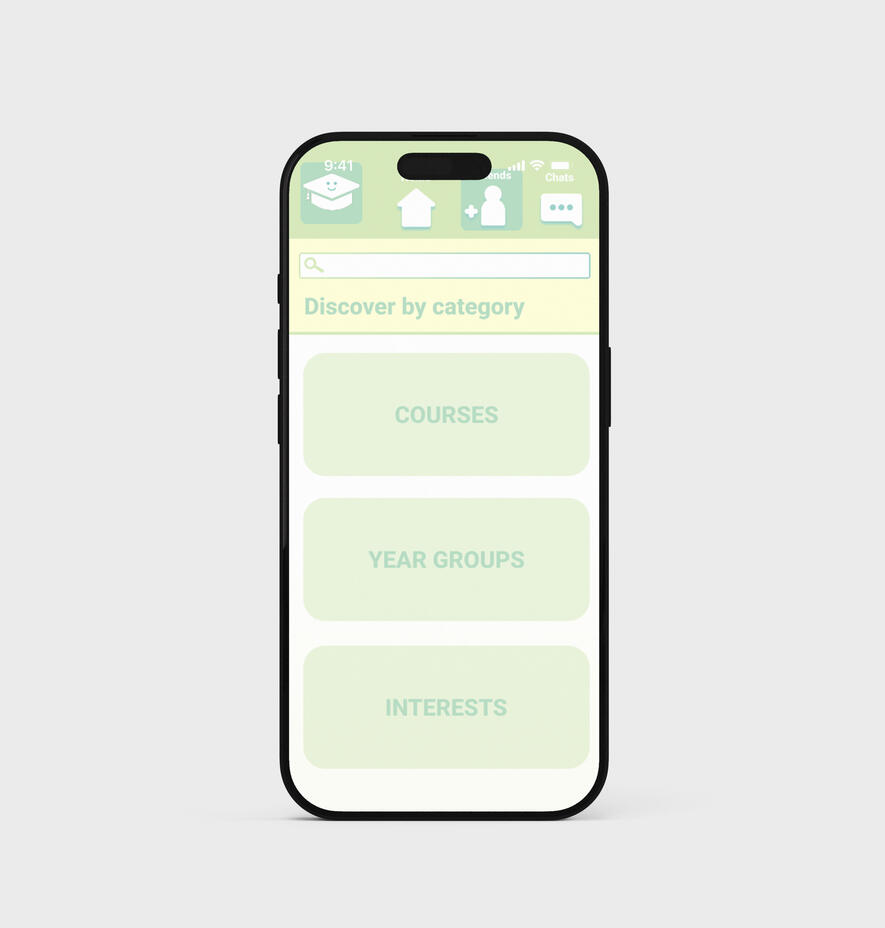
The chats have a description system so that users can find exactly what they’re looking for using the search bar on the top of the main page, there’s also a ‘discover by category’ feature. The interface design was made to be easy to navigate by the user, and I designed the icons to look clean but friendly for a more enjoyable app experience.During this project, I conducted interviews and sent out surveys in order to find out what would have benefitted students in their first year of university and found that people think going out helped them to meet new people, which is what inspired the concept of StudentU. I found this very helpful in the creation process and I also really enjoyed speaking with people about their university experiences.
iAnna
Motion design
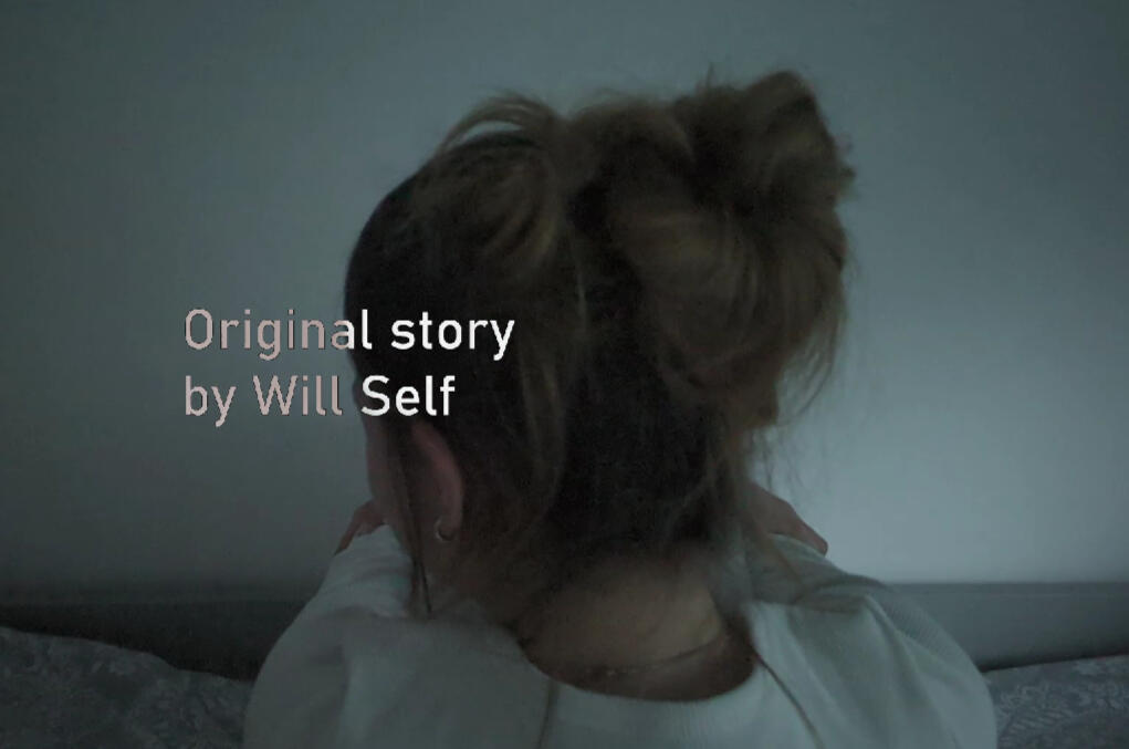
IAnna is a short story by Will Self that is focused on a girl called ‘Anna’ who lives with schizophrenia and thinks the world is her iPad. For this module brief we were tasked with creating a title sequence style video for the story using Adobe After Effects.
This was my first experience with the software, and with the help of tutorial sessions at university I was able to build up my skills to be able to use the software comfortably.
During development I researched into what life with schizophrenia is like in order to be able to portray Anna’s world in the title sequence. I also looked into many title sequences and how they are made up as a reference for how I should proceed.
My main goal was to portray the dark and isolating mood of Anna, all the shots I filmed are her by herself stuck in her inner ‘iPad’ world, and the end symbolises how she has lost herself and her identity.
I was really proud of this project and definitely felt more confident with motion design after its completion.